The Emotion Behind Every Hue
Article originally published on Haworth Spark
Color is more than aesthetic. It’s instinctive. It stirs memory, signals mood, and shapes the way we move through space. For Laurie Pressman, Vice President of the Pantone Color Institute, color is a language of emotion and intuition. Her journey—from merchandising floors to decoding cultural shifts—reveals how color connects us to what we seek, what we feel, and what we need. In a world saturated with visuals, it’s the emotional undertone of every hue that leaves a lasting impression.
Inside Laurie Pressman’s Path to Pantone
Laurie Pressman’s journey into the world of color wasn’t linear—it was layered, intuitive, and deeply human. From early days in merchandising to her long-standing role at Pantone, she’s always been drawn to what’s next. “I’ve always been about what’s new,” she says. “Even growing up, I wanted to make my own statement.”
Pressman’s father’s housewares business exposed her to retail at a young age, and that experience shaped her understanding of consumer behavior. “I was constantly changing the selling floor,” she recalls. That instinct led her to color, the first thing we connect to unconsciously. Her background in psychology adds depth to her work because color is all about mood and emotion—it’s about how people feel.
That understanding informs Pantone’s collaborative approach with clients. Now in her 25th year at Pantone, Pressman has helped shape the Pantone Color Institute into a global network of specialists. “We’re like color anthropologists,” she says. “We get a beat on the culture and understand the language of color.” Her team spans industries and geographies, constantly reading, researching, and connecting the dots—from food and fashion to tech and travel.
Inside Pantone’s Creative Process
At Pantone, the work is highly collaborative, and egos are left at the door. That spirit of trust and openness is what makes the Pantone Color Institute unique. Whether it’s for a fragrance or a piece of furniture, the process is tailored, thoughtful, and rooted in meaning. “It’s not about hierarchy—it’s about contribution,” says Pressman. “Creativity takes courage. You have to feel empowered to speak up, to make mistakes, to learn.”
 The work is both analytical and emotional. “It’s not just about trend—it’s about why it’s happening,” says Pressman. “What’s going on with the consumer psyche?” Pressman’s team is insatiably curious, and their research spans everything from macroeconomic shifts to art exhibitions. “There are reasons why consumers engage with colors when they do,” she says. “You can trace back what was happening in the world by looking at the colors of the time.” For example, post-WWII, the bright colors reflected excitement and happiness, mirroring a sense of victory and renewal.
Behind the Color of the Year

Everyone wants to know: How is the Pantone Color of the Year determined? It is not chosen lightly. “The story drives the color,” Pressman explains. “We look at the mood, the cultural moment, and what people are seeking.”
It’s a process of ongoing conversations, shared images, and emotional resonance. “There’s never just one color,” she says. “We zero in on a family, then a color, and the name must instantly convey meaning. We ask: What emotion are we trying to evoke?”
Take Mocha Mousse, for example, a response to post-COVID comfort, foodification, and the rise of organic luxe. “People wanted something light, neutral, and honest,” Pressman says. “The browns became part of nature, part of sustainability.” The name itself—whipped, soft, and comforting—was chosen to evoke emotion and familiarity.
How AI and Tech Are Shaping Color Trends
In today’s flat digital world, brands crave texture and emotional connection. Every color expresses its own unique meaning. That’s where Pantone steps in, especially as companies outsource creative direction. “We become their partner,” Pressman says, “helping them translate insights into color strategy.”
We all see the ways technology is reshaping the landscape, but Pressman considers AI a tool, not a replacement for human intuition. “Design is about humanity—empathy, vision, taste,” she says. During COVID, digital palettes surged— brighter, more vibrant—but now she sees a shift toward “soft tech” pastels with a futuristic feel, reflecting a desire for digital detox. Enter Cloud Dancer, Pantone’s 2026 hue. It whispers calm and serenity. A visual exhale in a world of constant motion. That same tension between tech and tranquility frames the next chapter: AI’s role in design.
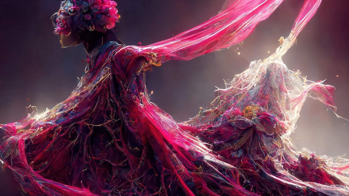
 Pantone experimented with AI during the launch of Viva Magenta, the 2023 Color of the Year. “We used AI as a design tool,” Pressman says. “But it’s only as good as the direction you give it. It won’t replace craftsmanship or aesthetic judgment.” She describes AI’s output as lacking nuance and emotional depth. “There’s a coldness to it. It can’t write to something it’s never seen.”
Connecting Through Color: More Than Visual
The storytelling behind color is just as important as the color itself. “People want a narrative,” Pressman says. “In a digital world, they’re looking for texture, for emotional connection.”
Whether it’s brand color or product color, the message must be clear: What does your brand stand for? Who are you trying to reach? What’s the lifespan of the color?
Her reflections are a reminder that color isn’t just visual—it’s visceral. It’s how we connect, how we express, how we feel. And in a world that’s constantly shifting, the Pantone Color Institute helps us make sense of it all—one hue at a time.


Some things are too good to keep to yourself.